Windows 11 Quick Design Impressions

If you haven’t heard, Microsoft recently announced Windows 11, a free upgrade for Windows 10 users. After seeing the event, here were my Windows 11 design impressions.
Aesthetic
It’s clear that they’ve spent a ton of time redesigning the core look, but it also feels like the natural (or ‘borrowed’) result of recent design trends. With a nod to Windows design history (they did do blur first in Vista after all), Google Material’s ‘layers’ mentality (It’s all sheets of paper, I mean glass…), iOS’s heavily rounded corners, and Chrome OS / MacOS’s centered application icons, it all feels elegant if not inevitable.
Mobility
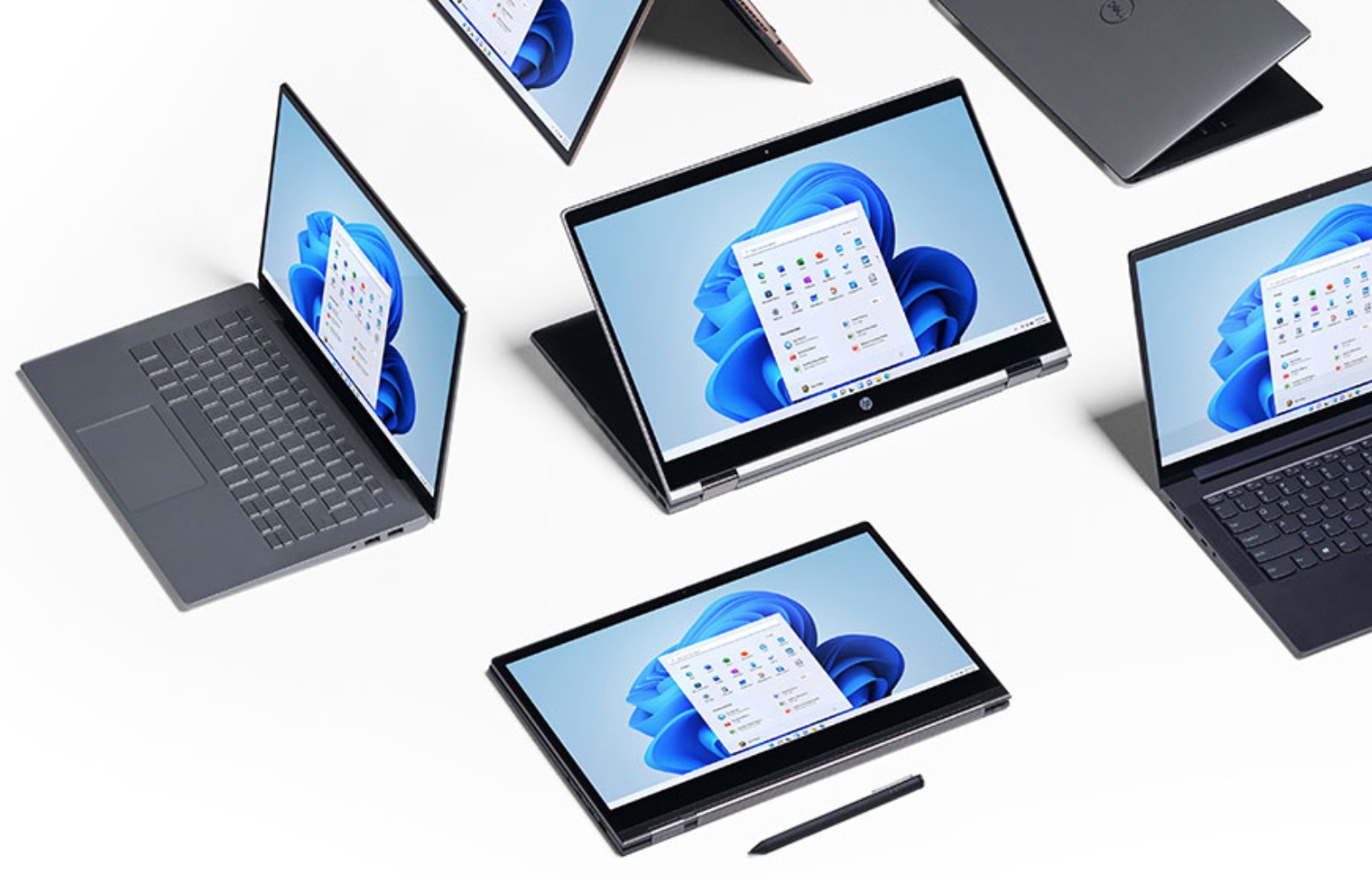
This is one area I believe that Microsoft pioneers consistently through products like the original Surface (a coffee table), Surface Studio, the Surface Duo, and so on. The idea is that the screen is just a container for the content. Modality and inputs adjust the spacing, touch targets, and functionality. This is exactly the way fluid design should behave.
Windows 11 follows suit and maps tablet mode buttons to the center to avoid accidental thumb interaction, although a rogue thumb it seems may mess with the status tray & time on the bottom right.

Chat and Widgets
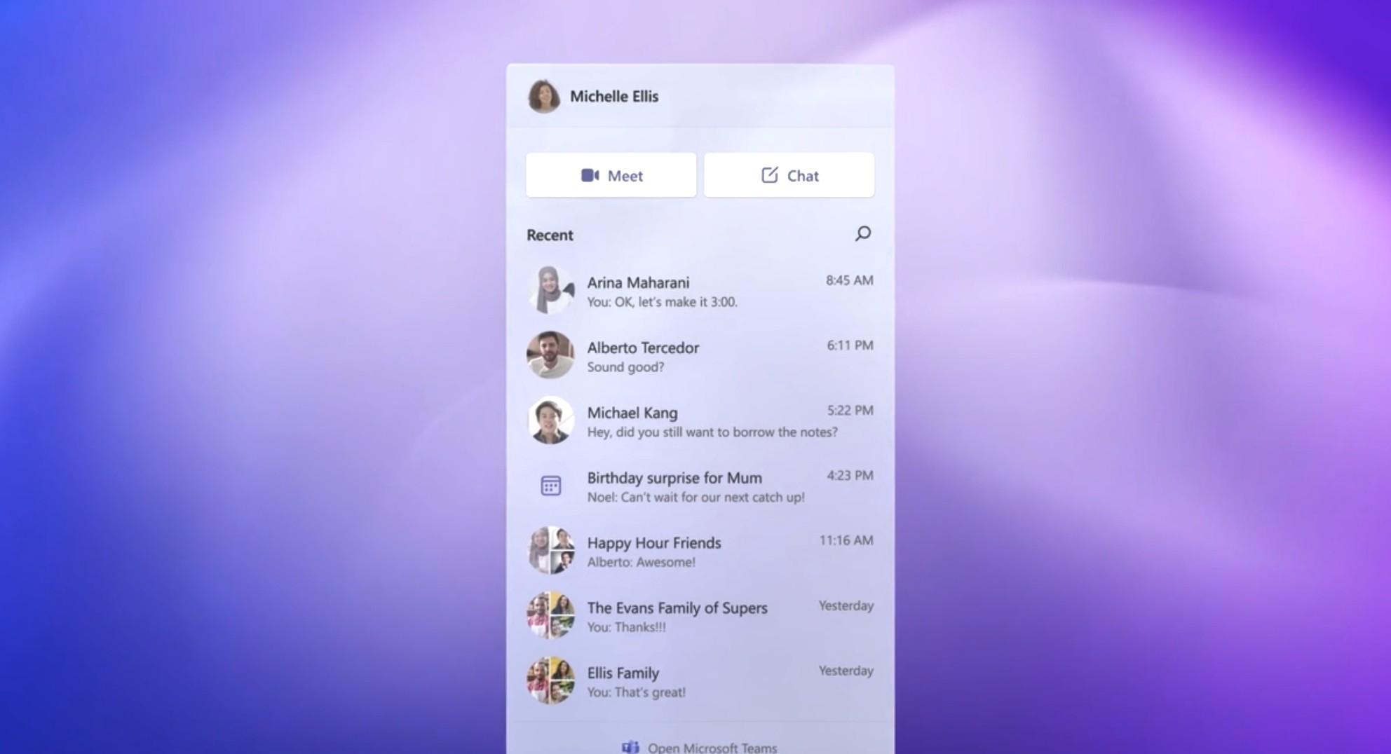
I personally love bite-sized info that appears without the full context of the application. The new chat (is it Teams only?) has potential IF it is a universal sort of thing where all chat APIs could tie in ala Franz (or for you legacy folk, Trillian or Pidgin).
The same goes for the other potential widgets. Calendar, reminders, and weather are all widgets I use on every other OS at the moment. With Windows support, this will finally be ubiquitous for me. Again, this is a throwback to Vista and Windows 8.

Bloat?
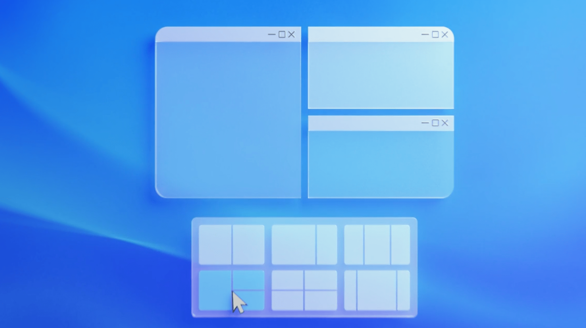
Both the preset layout stuff and the Android app support stuff honestly feels more like bloat to me. I guess I’ll have to wait and see how it really shakes down later.

Other Things I Hope to See
Rumor has it, Microsoft is finally fixing all the old icons in the Shell32 asset that have been the same since Windows XP and Windows 95… It’s one of those small touches that would make me so happy.
And my final hope is that 4K monitor support compatibility is radically improved. I have so many one-off apps that totally break in high DPI mode that it can be very frustrating.
Conclusion
Overall, my Windows 11 design impressions are that it looks like the improved style and mobility innovations will probably make long hours on the device feel much more enjoyable, regardless of modality. Can’t wait to get my hands on it to see how it feels for real.
And hey, if you want some of these things now, check out my article on improving Windows here.