About
Great design meets people where they are and shows them where they could be – just enough, at the right time, in the right way. Understood, enjoyable, measurable, scalable, used.
Saved by grace, husband, father, and UX Designer. I’m upbeat, self-taught, creative, enjoy a laugh, hard-working, and get ideas into the web.
I have over 25 years of experience working with many government agencies, international brands, neighborhood businesses, mom-and-pop’s, and everything in between. I’ve been an employee, freelancer, and government contractor.
In my current role, I’m a Senior UX Manager and drive our design system toward accessibility out-of-the-box for Fortune 100 companies.
Check out a few case studies around specific areas of focus.
Accessibility
Around 2015, the accessibility strategy at my org was very limited – no central group to execute anything meaningful, little to no awareness by development or design, and add-on sets of files to help with one-off accessibility issues. We needed to scale – our clients expected more from us.
Strategy
First, I built a cross-org accessibility coalition, and introduced user testing through partnerships with the excellent “Carroll Center For the Blind”. I invited designers, engineers, and other key stakeholders in to watch the sessions, and recorded them for wider distribution to set our benchmarks for success.
Around this time, I also drove org-wide education through an internal summit, and began giving talks to our government clients during important meetings in DC.

And since we were also getting ready to build our UX system – there was a clear opportunity to do the right thing from the foundational layer. Spending time with WCAG and ATAG, drawing both directives and concepts from them, and focusing on a semantic HTML and content-first direction allowed me to coordinate every design component with accessibility in mind. I’ve guest-posted about some of the thought process and talked about it on AXSChat.
To make sure that components & the system were executed properly, we also needed to level up development. Implementing tools like aXe into builders workflows, procuring assistive tech and resources to learn them for dev teams to access, and partnering with Level Access for certified application statements (VPATs) and reviews were the next step in our process.
Impact
Accessibility became a core organizational capability. The company established a dedicated accessibility function, while I lead accessible design at scale through the design system and UX operations.
Today, governments (US, UK, Australia, and others) and clients all over the world use & trust our approach to accessibility. I’ve also been able to collab with one of the best in India, our compliance to VPATs has never been higher, and I’m a certified US Trusted Tester. And if you like, tune into our ongoing podcast I still co-host to this day – Accessibilty@Pega.

Design systems
Our previous front‑end apps had become dated, overly customizable, and inconsistent, with styles scattered across apps. That fragmentation led partners, clients, and internal teams to produce messy, incoherent interfaces that hurt our reputation with new prospects, making it clear the experience needed a reset.
Strategy
We needed a design system that could be unified & scale, since most needs shared the same core workflows. That responsibility was placed on me.
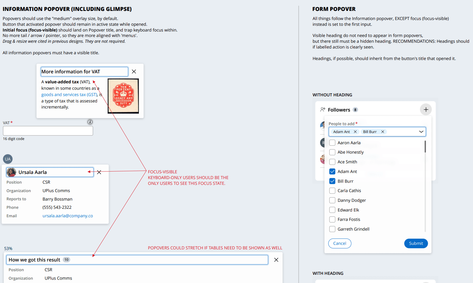
First, I started by having the team review our apps and rank the most important flows and components. With that list, I coordinated design for our components with modern HTML and CSS in mind for the first time since the ASPX era. Accessibility shaped many of the choices, helping us support government clients and making it easier to settle design debates. Building around user font size also let the UI scale naturally for low‑vision users and set us up early for localization.
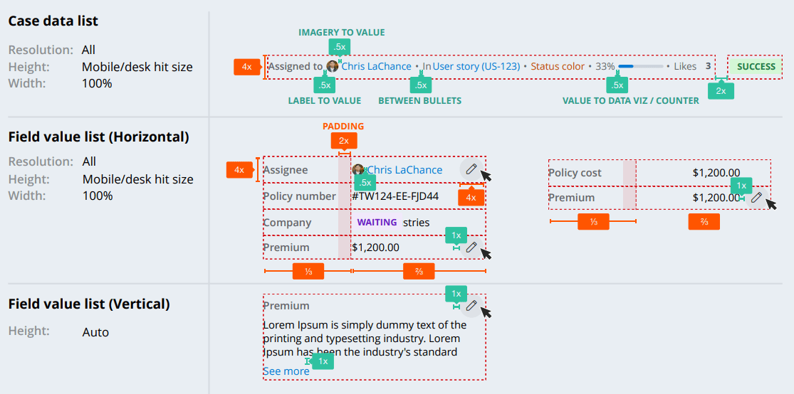
Next, I set up regular component‑design meetings so designers and stakeholders could share goals, use cases, and edge cases. Because we supported web, iOS, Android, and legacy systems, we relied heavily on design tokens to keep everything consistent, designing for both happy & crappy paths.
The design work was the toughest part. Many teammates were stretched thin, so I handled most of the hands‑on design and brought it back for stakeholders to review. Our new front‑end team partnered closely with us, and together we shipped the first phase within a year. We documented everything on an external site and shared a public Figma library to make adoption easy. The system continues to evolve with steady oversight from me and a few others.

Documentation and promotion were key. An an external site to document decisions, and a public Figma library made the system easy for both internal and external teams to use. The system continues to evolve, with steady updates guided by me and a small group of contributors.
Impact
Even with a few of the small bumps in the road – the system was a wild success. The prescriptive nature of the system – while uncommon for design systems – was the absolutely correct approach. It has scaled well and prevents the most egregious issues we’ve seen in the past. Additionally, we’ve learned how to bend the system in ways to clients’ needs without breaking it, similar to bamboo.
Today, it has becoming the backbone of our authoring system and extending it for that is giving new powers to the end-user experience.
Design Ops
Shared workflows and differing tools had become impossible to manage. Our designers all had their own methods, and stepped on each others toes – often doing double work. Standards were being set that we couldn’t realistically follow, the team was stretched thin with a 1:70 design‑to‑dev ratio, COVID pushed us fully remote, and we were trying to build a new design system at the same time. It was clear the way we worked needed to change.
Strategy
I proposed combining our design system work with design operations, and my boss agreed. I started with a listening tour to understand each designer’s frustrations and bright spots, then turned that into a survey so the team could rank what mattered most. The message was clear: they wanted faster collaboration and clearer expectations. I also gathered feedback on tools and file‑handling habits.
I then asked developers and product managers how it felt to work with design. Many devs felt shut out of conversations, and some had stopped engaging altogether. Designers weren’t providing specs, leaving devs to guess at details or color‑pick from screenshots.
To address this, I introduced benchmarking surveys, created working groups and steering committees, opened shared chat spaces, built documentation and onboarding guides, added internal training, and developed consistent library assets. Regular updates kept everyone aligned and helped the changes generally stick.
Impact
The team now works from a single, shared toolset, and those choices scaled across the whole company so everyone could share design work the same way. We partnered with IT to keep plugins secure and published reusable design assets for outside groups working with our products. I later gave a talk on this at UXPA Boston in 2021, slides can be found here.

Even though Design Ops is a smaller part of my role now, I’m still looking for better ways to maintain our education decks and make a yearly basics review part of the team’s routine.